
The Problem
Many young adults attempting to quit vaping struggle not only with withdrawal, but with understanding their progress and coping with symptoms over time. Existing quitting tools often focus on streaks or abstinence alone, offering limited reflection, personalization, or social support. This creates a fragmented experience where users lack insight into their patterns and feel isolated during the quitting process.
Phase 1: Research & Discovery
This phase focused on understanding the lived experience of quitting vaping through primary research and synthesis. Over two sprints, we conducted expert interviews and a user survey, then translated findings into personas, user stories, feature epics, and early wireframes. This research fundamentally shaped Cloud9's language, feature direction, and approach to behavior change.
Expert Interviews
I led three interviews with addiction researchers and public health professionals specializing in nicotine use among young adults. These conversations provided nuanced perspectives on quitting strategies, relapse, and harm reduction that challenged my initial assumptions and directly influenced product decisions.
User Survey
I also contributed to the design of a short survey to understand vaping behaviors, motivations, and quitting patterns among young adults. This survey helped validate high-level trends, but the qualitative depth of expert interviews provided far more influential insights in shaping design direction.
Key Findings
- Nicotine use starts early Many vapers start as early as 12 years old and continue into college and beyond. However, others start vaping later in life as a way to quit cigarettes.
- People quit for many reasons Health concerns, financial cost, social pressure, and personal goals were all cited as reasons for quitting. One expert described that college students preparing to graduate often don't want to carry the habit with them into the next stage of life.
- Quitting is non-linear Success often involves gradual reduction, setbacks, and medical intervention, rather than strict abstinence. It typically takes multiple attempts to quit successfully.
- Language shapes user experience Terms like "relapse" feel loaded with judgment and can discourage continued engagement.
- Immediate support is crucial Users need tools that help them cope with triggers and withdrawal symptoms whenever and wherever they occur. This support should be accessible, personalized, and context-aware.
These insights were synthesized into personas, user stories, epics, and low-fidelity wireframes to guide the subsequent build phases.
Personas
Based on our research, we created four personas to guide our design decisions:
- Riley the busy college student
- Taylor the high school student with friends who vape
- Matt the parent of a vaping teenager
- Alex the adult who is struggling to quit
As the project progressed, Riley emerged as our primary persona due to strong alignment with our research findings and the team's ability to design and validate features within this context. Her story provided a clear narrative thread that guided the development of Cloud9's core features, ensuring that each experience was grounded in a relatable and empathetic context.

Riley Campbell
Age: 22 | Senior Engineering Student | West Lafayette, IN
Riley is a senior engineering student preparing for graduation and the transition into full-time work. She started vaping as a way to manage stress during demanding semesters and now worries about withdrawal impacting her focus and mental health. As she looks toward her next chapter, she wants to quit vaping without adding more pressure to an already stressful routine.
"I want to quit vaping, but I don’t want it to take over my life."
Goals
- Reduce or quit vaping without disrupting school or daily routines
- Understand what symptoms to expect and how to cope with them
- Enter post-grad life without carrying the habit forward
Pain Points
- Withdrawal symptoms increase anxiety and make it harder to focus
- Stressful academic workload triggers cravings
- All-or-nothing quitting narratives feel discouraging
Design Implications
- Surface symptom-specific insights tied to daily progress
- Support gradual reduction and reflection, not just streaks
- Provide calming, actionable coping strategies during high-stress moments
From Research to Product Direction
Research insights and personas helped us narrow our focus to a small set of problems we could meaningfully address within the scope of the project. Rather than designing for every possible scenario, we prioritized features that supported Riley's day-to-day quitting experience:
- Understanding and coping with withdrawal symptoms
- Gaining insight into one's own vaping habits
- Tracking progress through daily metrics
- Enabling real-time peer support and accountability
Based on our research and prioritized user needs, we organized Cloud9 into a set of feature epics. Each epic represented a core part of the product experience and allowed the team to work in parallel while maintaining a cohesive system.
Feature Epics
Profiles
User identity, preferences, and onboarding
Logging
Tracking symptoms, vape usage, and milestones over time
Groups
Joining and participating in peer support groups
Messaging
Communicating within support groups
Insights
Personalized guidance based on logged data and progress
Moderation
Ensuring group safety and healthy interactions
I served as the primary owner for the Logging and Insights epics, which formed the foundation for Cloud9's personalized experience. These epics translated research insights directly into day-to-day user interactions and informed many downstream design decisions.
Phase 2: Design
In this phase, we translated our research insights into low-fidelity wireframes, high-fidelity prototypes, and database designs. We focused on refining our initial ideas based on our research and began laying the technical foundation for the product. We also developed a project management plan and began to define the technical stack for the project.
Low-Fidelity Wireframes
With core epics defined, we explored low-fidelity wireframes to validate our initial hypotheses and feature ideas before committing to visual design or implementation. These wireframes focus on the core user flows associated with logging vape usage and accessing insights into one's own quitting journey.
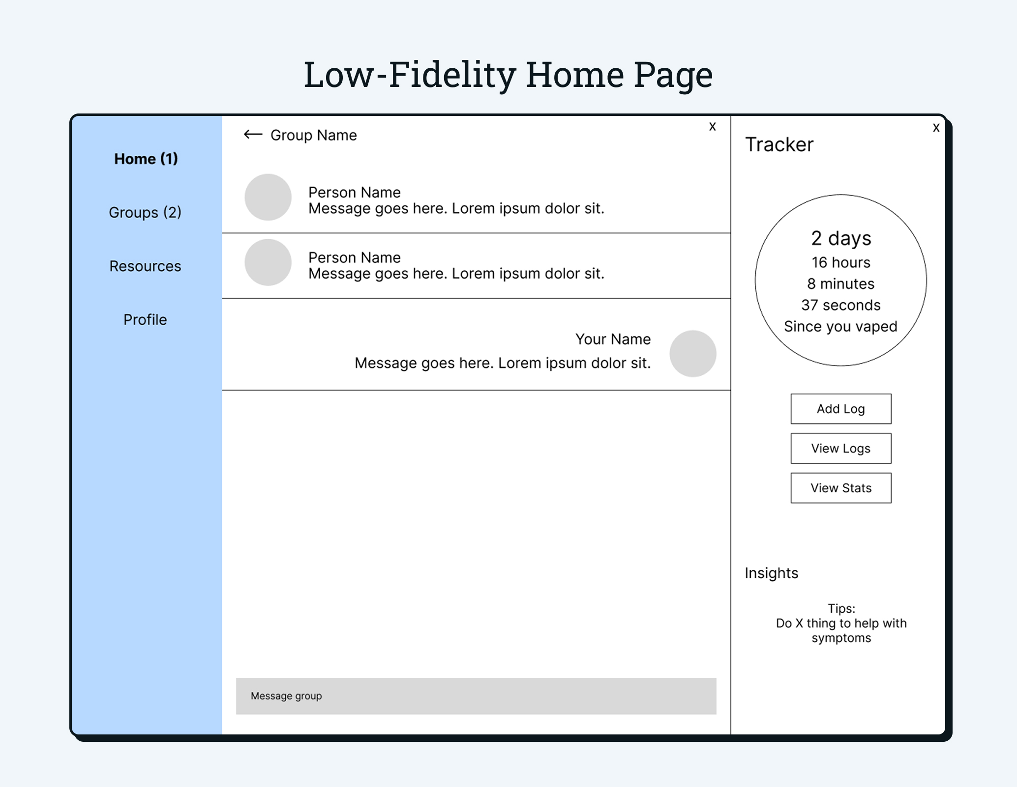
Home Page
The home page was designed as a daily check-in point where users can quickly understand their progress, access support, and reflect on their journey without cognitive overload.
- Persistent tracker: Time since last vape is always visible to make progress feel tangible
- Low-friction actions: Commonly used actions like logging, viewing stats, and messaging support groups are accessible immediately upon opening the app
Initial Logging Concepts
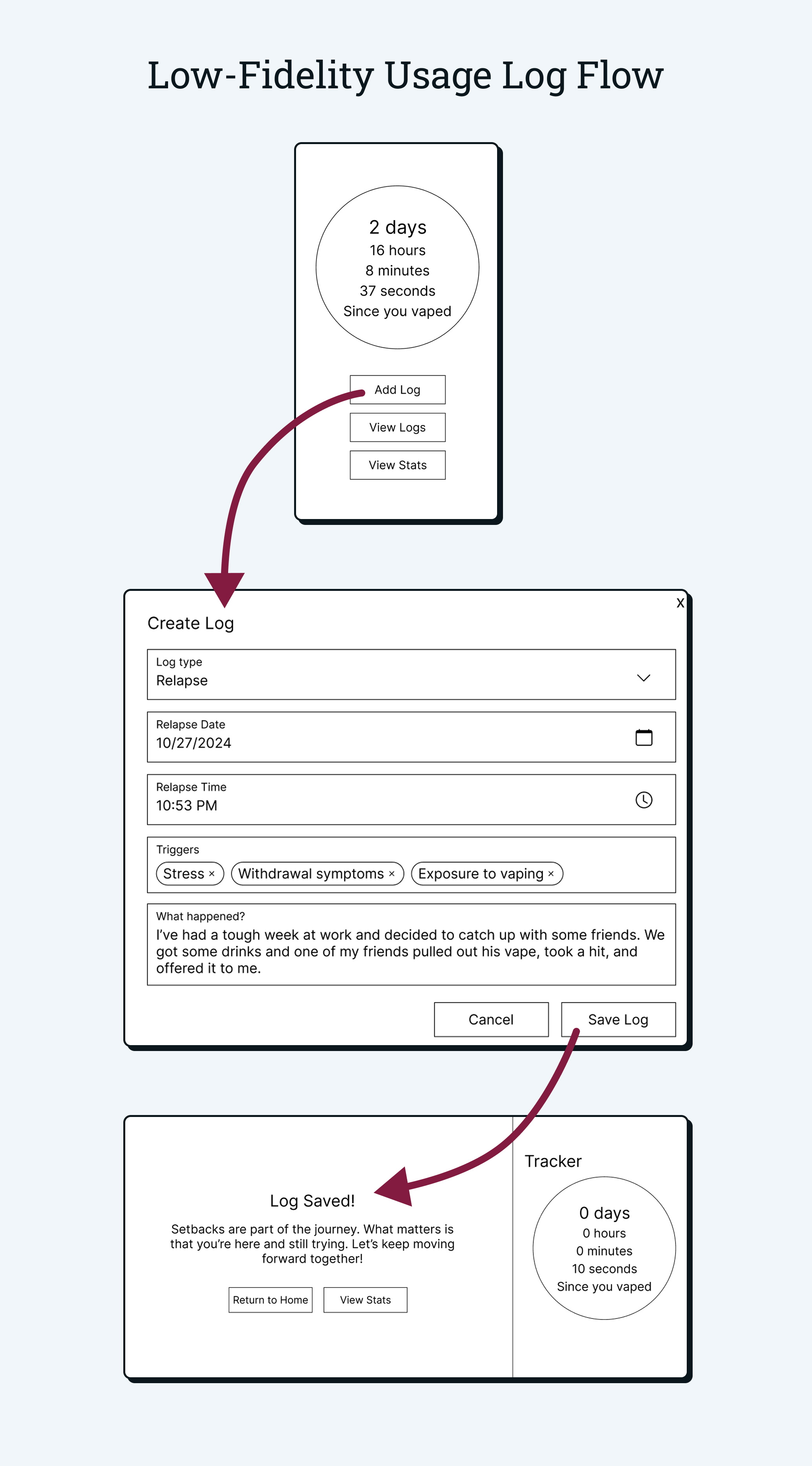
Early logging concepts focused on giving users a structured way to record vaping events and the circumstances surrounding them. At this stage, the primary goal was to support reflection and pattern recognition, and data caputred through logs would be used in data visualizations.
- Event-based logging: Users could record vaping events with date, time, and contributing triggers
- Context over judgment: Even early designs emphasized capturing circumstances rather than assigning blame. The goal was to suppport users in understanding their behavior by promoting reflection and self-awareness
- Foundational data capture: Logs were designed to create a data backbone for other features. At this stage, the intention was for the data to be used in data visualizations, but that would be changed as the project progressed
Early Insights Model
Initial insight designs were based on the assumption that time since last vape was the most meaningful indicator of user needs. Insights were delivered at predefined milestones such as one hour, twelve hours, and multiple days without vaping.
- Milestone-driven insights: Guidance surfaced based on elapsed time rather than user input
- Educational focus: Early insights emphasized general information about withdrawal timelines
- Low interaction cost: Users could quickly access insights without logging additional data
While this approach provided helpful baseline education, it treated quitting as a uniform experience and did not account for individual symptoms or emotional states.
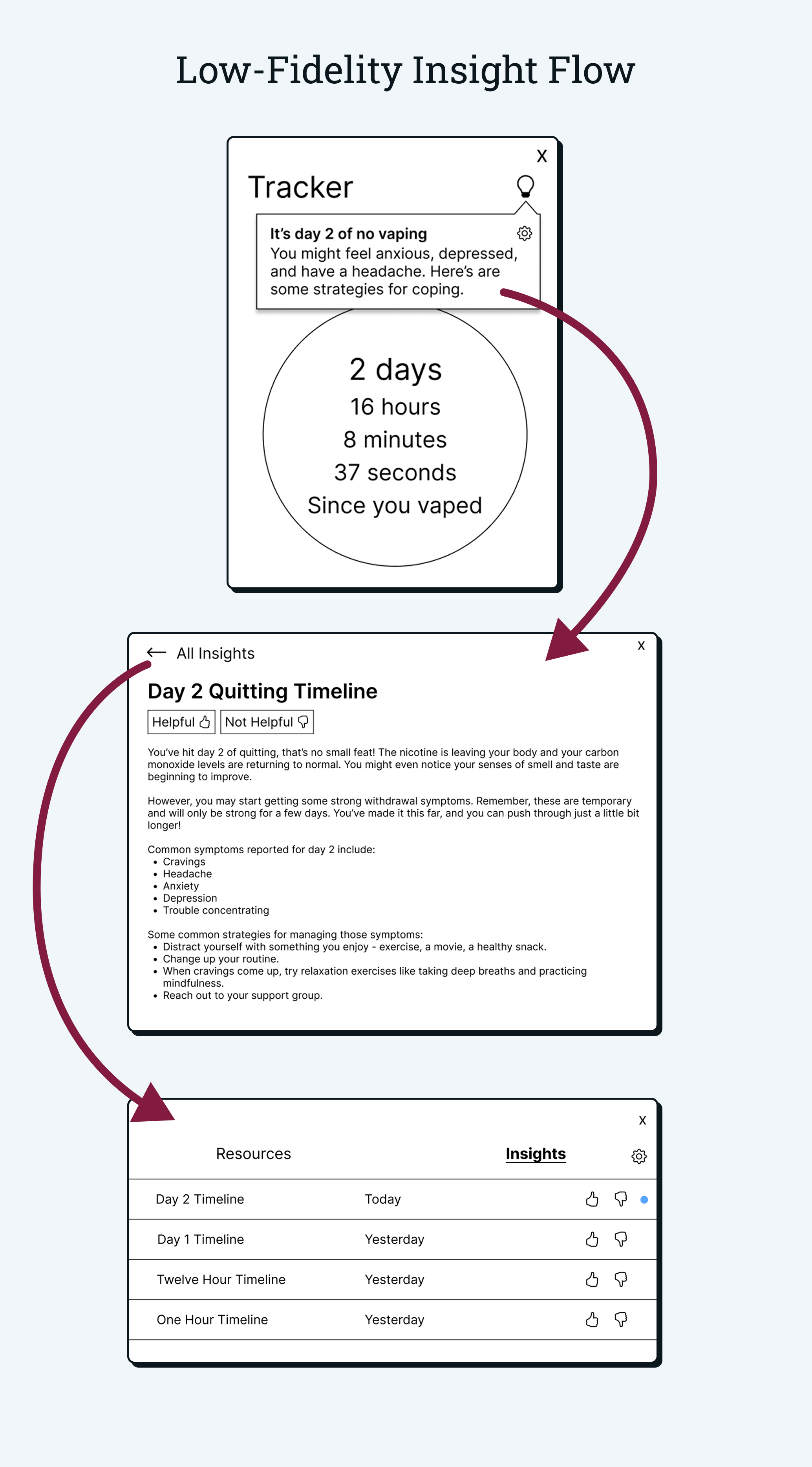
As we conducted additional research and usability testing, these assumptions were challenged. Insights later evolved to respond directly to user logs and symptoms, enabling more personalized and empathetic guidance.
Refining the Product Direction
While early wireframes focused on validating core concepts, the transition to high-fidelity design required several foundational decisions. These decisions were informed by research synthesis, instructor feedback, and technical feasibility considerations.
Design Changes
- Shift toward neutral language Early designs used terms like "relapse" and "setback" to describe vaping events. Based on research and expert feedback, I recognized that this framing could create feelings of discouragement and suggest that complete abstinence was the only way to quit. I decided to change the terminology to "vape usage" and remove dialog that stated that implied that any usage was a failure.
- Symptom-based insights Insights were originally triggered solely by time since last vape, but I realized this may result in users receiving repetitive messaging if they logg mutliple vape events. Additionally, I wanted the insights to be able to give targeted advice based on the user's specific symptoms.
- Splitting usage and symptom logs To support more nuanced insights, I decided to split logs into two distinct types: usage logs and symptom logs. This separation allowed the system to distinguish between behavioral events and physical or emotional experiences, improving both data quality and user clarity.
- Removing the data visualization concept As the logging and insight concepts became more developed, the visualizations associated with log data grew outside the scope of this project. I decided to remove this feature from the initial version of the product and instead prioritize core functionality.
High-Fidelity Prototypes
With the product direction refined, we moved on to creating high-fidelity prototypes in Figma. These prototypes were used to validate the design decisions and provide clear direction for the development phase.
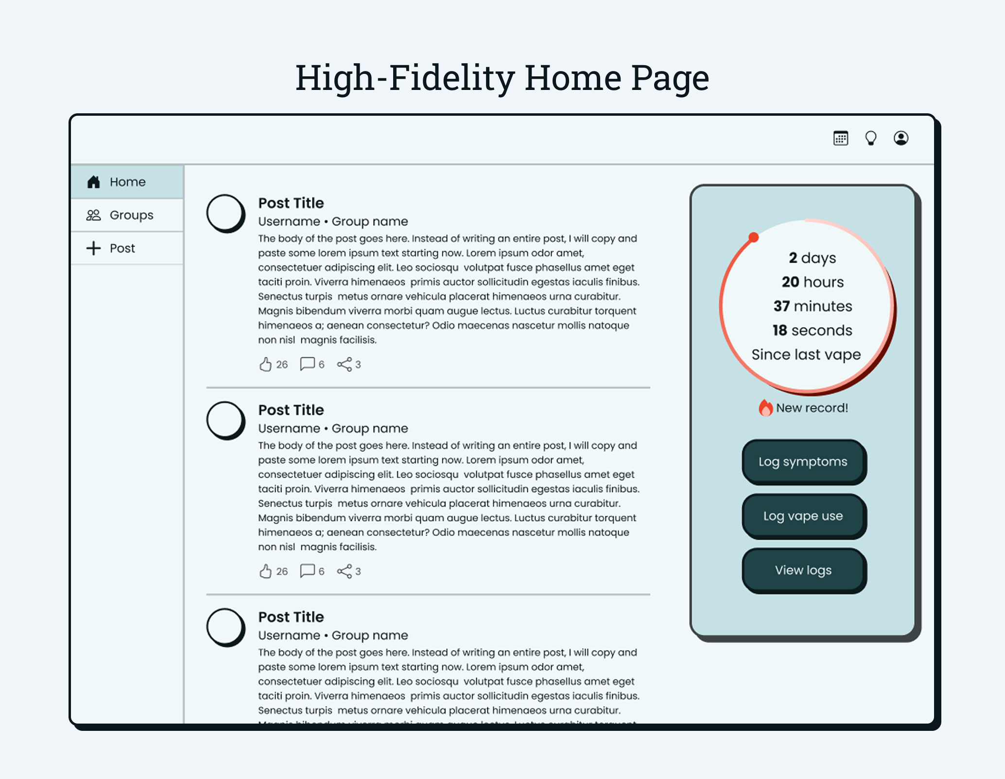
Home Page
The home page remained largely unchanged from the low-fidelity prototype, but with more refined visual design and reworked navigation patterns. The primary goal remained to provide clear starting points for the main functions of the app: progress tracking and peer support.
Revised Logging and Insights
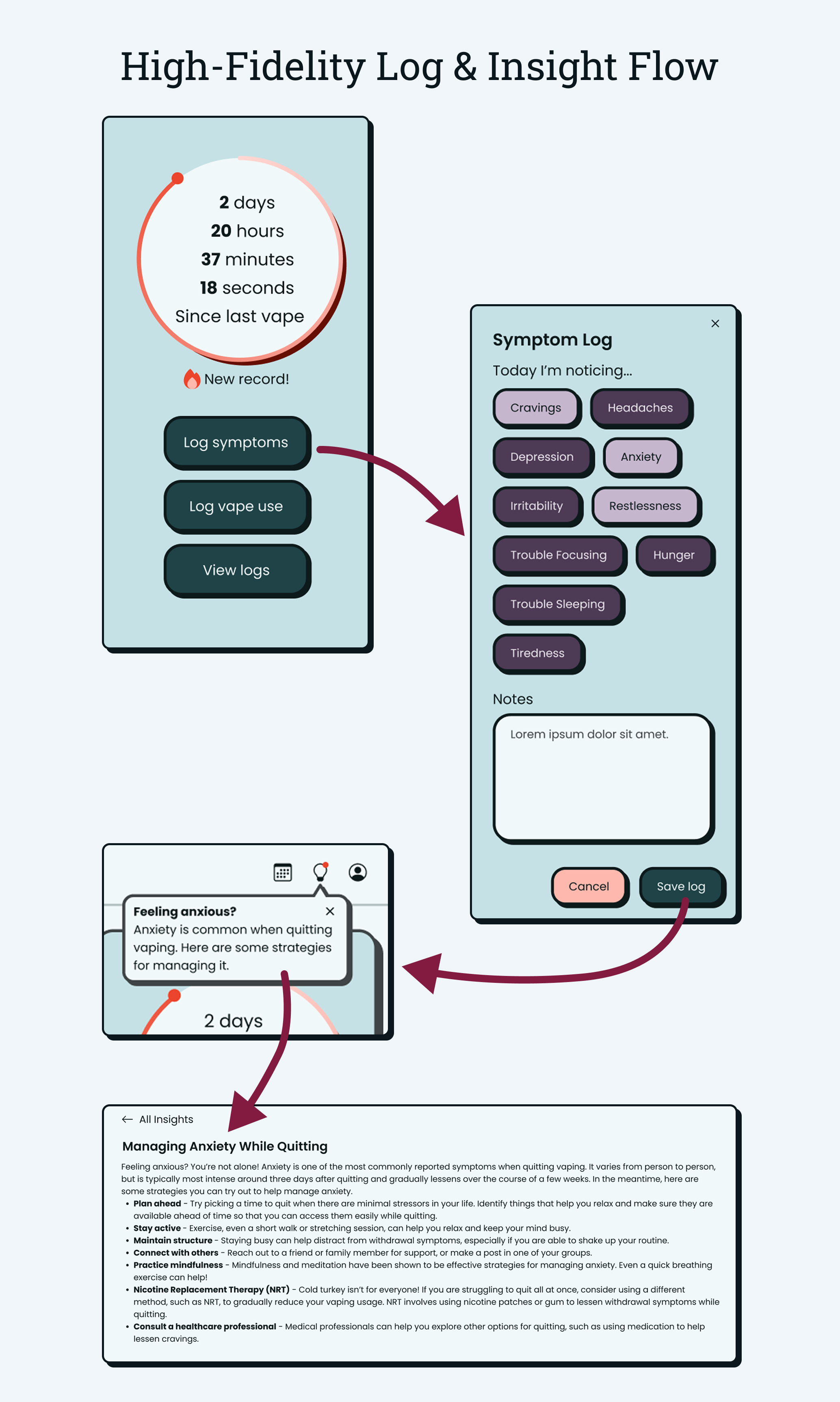
This flow demonstrates how Cloud9 responds dynamically to user input. Logging symptoms not only records data, but directly influences the guidance users receive in the moment.
- Separated logging paths: Users can log symptoms or vape usage independently, reducing friction and improving data clarity
- Symptom-driven insights: Logged symptoms trigger relevant guidance, shifting insights from time-based education to personalized support
- Just-in-time delivery: Insight popups appear immediately after logging, offering reassurance when users are most receptive
Phase 3: Development
The development phase focused on translating validated designs into a fully functional web application. Over eight weeks, I implemented core features end-to-end, balancing technical constraints, evolving requirements, and real-world usability considerations.
Implementation Highlights
Logging system
Built symptom and vape usage logging with structured inputs, validation, and persistent storage
Insights engine
Implemented logic to surface personalized guidance based on logged symptoms
Dashboard & tracker
Developed the home page tracker and supporting views to reflect real-time progress
Full-stack integration
Connected frontend interactions to backend logic and MySQL database structures
Adapting to Technical Constraints
One project requirement was the use of two external APIs integrated with our database. When an initially planned API was no longer viable due to technical and scope constraints, I incorporated the Google Maps API into the logging flow to capture location data for vape usage logs.
- Integrated Google Maps API to allow users to associate locations with usage events
- Stored location data alongside log entries for future analysis and insights
- Preserved the original intent of contextual logging while meeting course requirements
Built Product Preview
The following screenshots show the application in a functional state during development, demonstrating key user flows and system behavior.
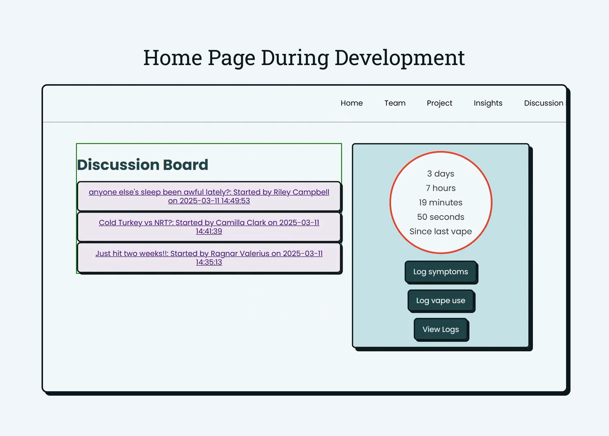
Home Page During Development
This screenshot shows the home page as implemented midway through development. At this stage, almost all of the core features had been implemented and were ready to be validated through usability testing.
- Functional tracker: Time since last vape updated dynamically based on user logs
- Integrated discussion board: Community content was live and connected to user accounts
- Actionable entry points: Logging symptoms or vape usage remained one click away
Symptom Logging and Insights
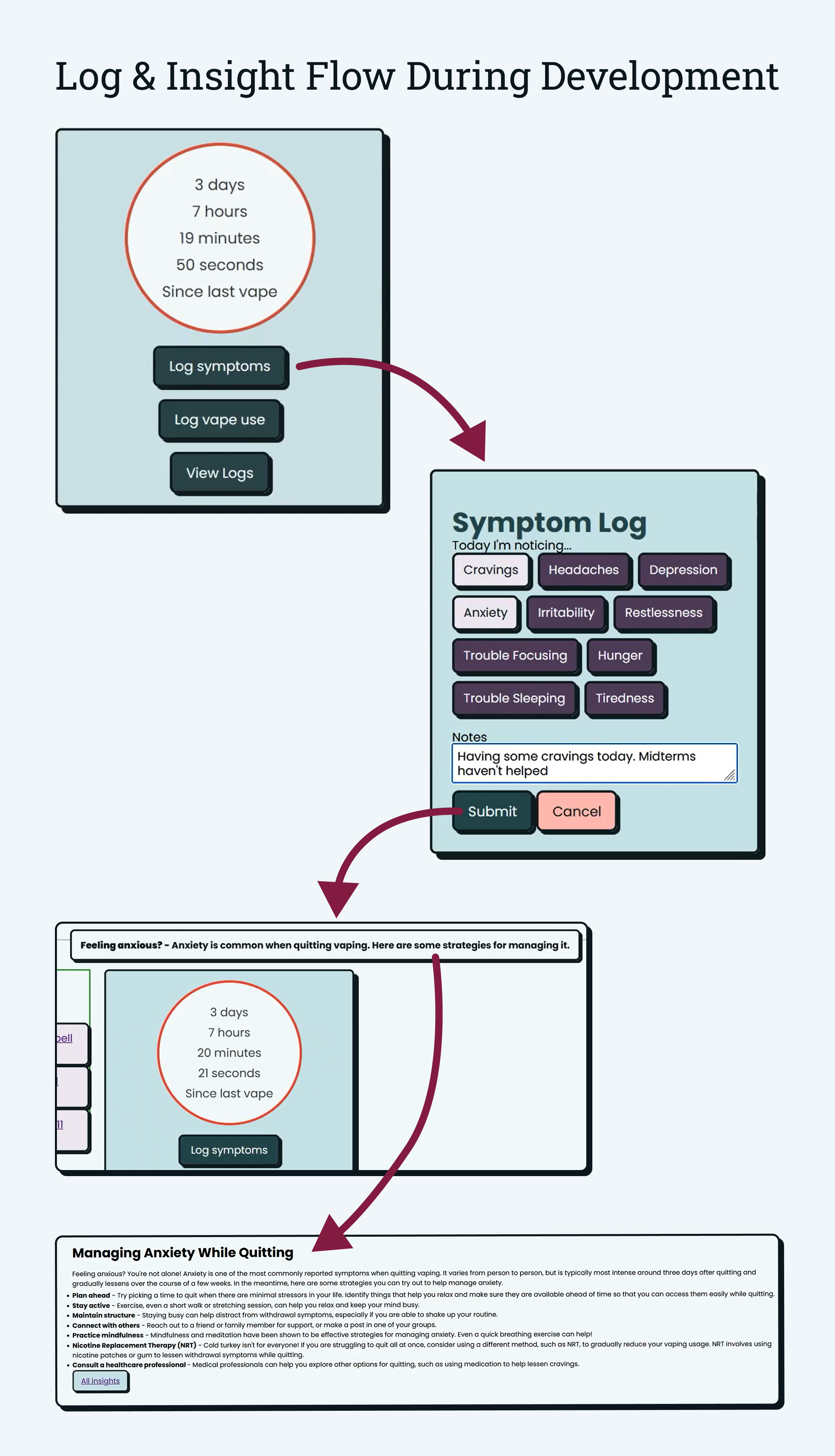
This flow demonstrates the system behavior after a user logs symptoms. Logging directly triggers relevant insights, creating a feedback loop between user input and guidance.
- Symptom logging: Users could select symptoms and add contextual notes, which were stored and processed by the system
- Immediate insight delivery: Logging symptoms triggered a relevant insight without requiring additional navigation
- Progressive disclosure: Users could move from a brief popup to a full article with coping strategies to provide more detailed information when users were ready
- Data-driven behavior: Insight content was determined by logged symptoms to provide personalized and relevant guidance
By the end of the build phase, Cloud9 was a fully functional system with end-to-end flows supporting logging, insights, and community interaction. While the core architecture and feature set were in place, this stage also marked the point where assumptions could be validated through real user feedback.
Phase 4: Iteration
With a functional system in place, we entered the iteration phase to evaluate how well Cloud9 supported users in practice. This phase focused on identifying friction across core flows and validating whether design decisions translated into intuitive experiences.
Usability Testing
We conducted moderated usability testing with a mix of mental health professionals, addiction researchers, and vape users. Sessions began with background questions, followed by free exploration using a think-aloud protocol, and concluded with a set of task-based evaluations covering the full system. After each task, participants rated difficulty and shared feedback, followed by exit questions to surface additional insights.
Key Findings
While testing confirmed some known issues, it also revealed more systemic problems with navigation and comprehension. Users consistently struggled to locate core features and understand how insights related to their logged data.
- Navigation friction: Users found the nav bar cluttered and misaligned with their goals
- Log discoverability issues: Participants had difficulty finding and returning to log forms
- Insight confusion: The popup-based insight system felt disconnected and easy to miss
Design Changes Based on User Feedback
- Reworked navigation Simplified the nav bar to focus on primary user tasks
- Removed insight popups Eliminated time-limited popups that users found disruptive
- Created a log detail page Centralized all log information and related insights in one place
- Expanded insights per log Displayed guidance for every reported symptom
Final Design
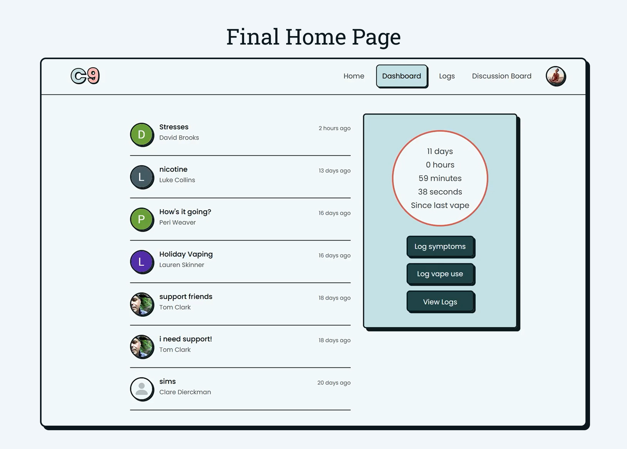
Home Page
The home page remained the central hub for the app, but with more refined visual design and clearer navigation. The navigation bar was simplified to focus on primary user tasks, with less relevant pages moved to the footer.
Symptom Logging and Insights
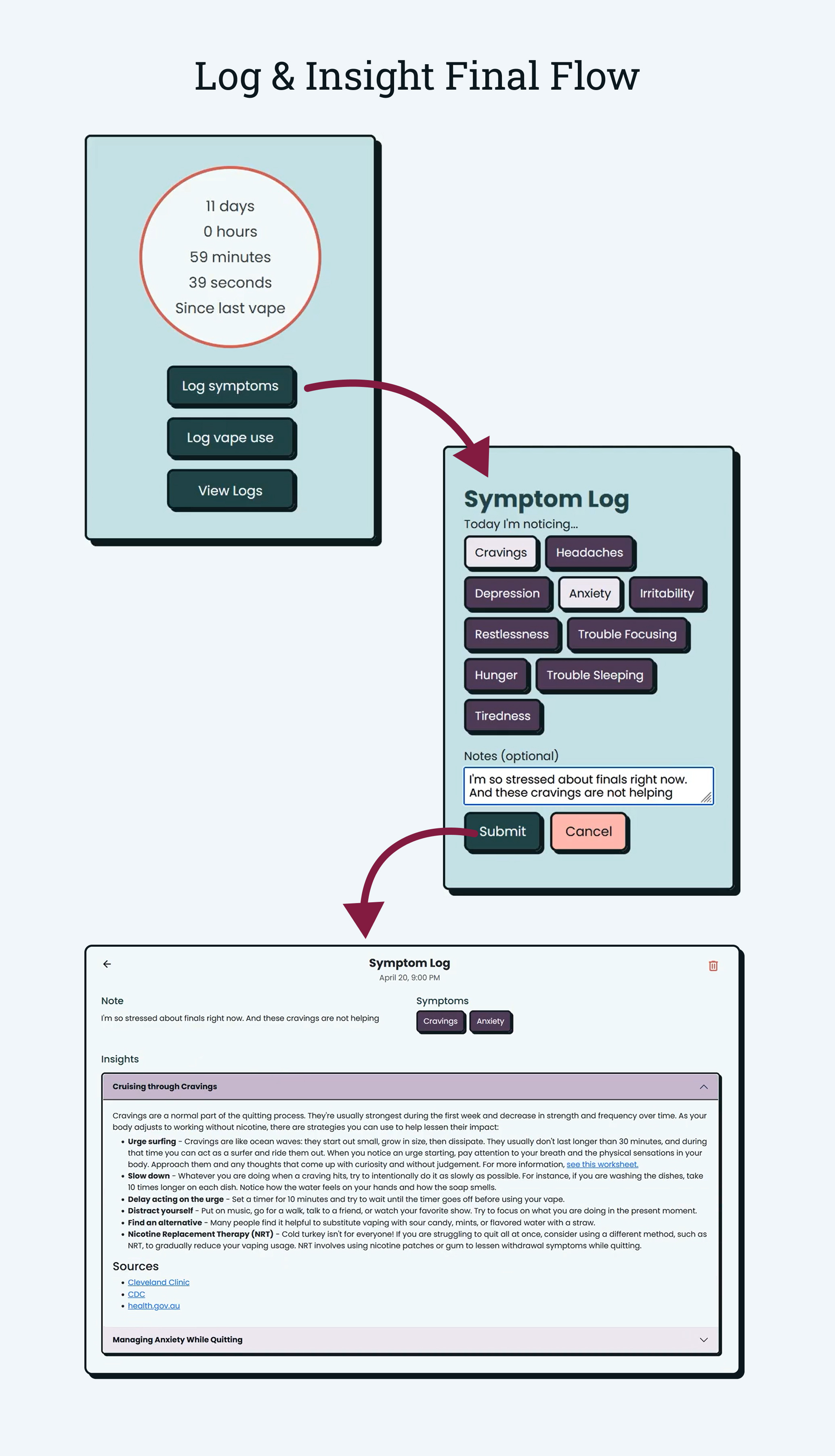
Usability testing showed that users found the insight popup disruptive and disconnected from their logs. In response, the insight system was redesigned to live directly alongside logged data in a dedicated log details page.
- Direct transition: After submitting a symptom log, users are taken directly to a log details page rather than returned to the home page
- All relevant insights: Insights are displayed for every selected symptom, eliminating randomness and information loss
- Clear relationship between data and support: Logs and insights are now visually and conceptually linked
With these changes in place, the link between logged data and supportive insights became more direct and intuitive. Users could now see exactly how their logged symptoms were being used to generate relevant guidance, and could easily return to the log details page to review whenever they needed support.
Phase 5: Delivery
The final phase focused on presenting Cloud9 to a broader audience through visual, interactive, and in-person formats. This stage emphasized clear communication, storytelling, and demonstrating the product’s value beyond the classroom.
Capstone Fair Presentation
Cloud9 was presented at the senior capstone fair, where attendees explored projects through live demos and conversations with project teams.
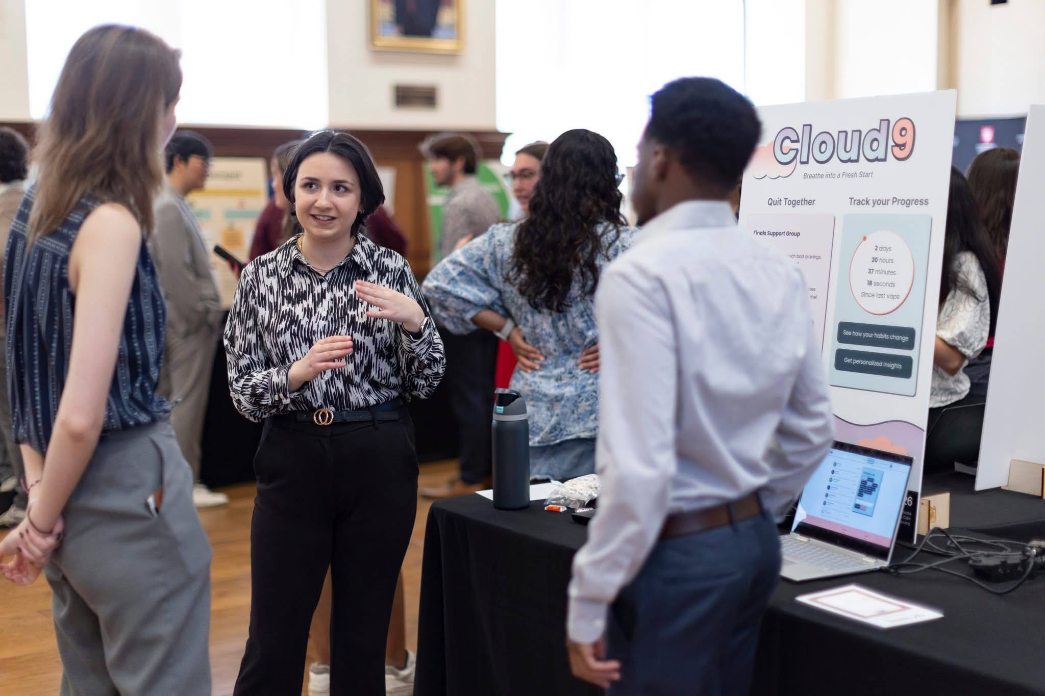
Capstone Poster
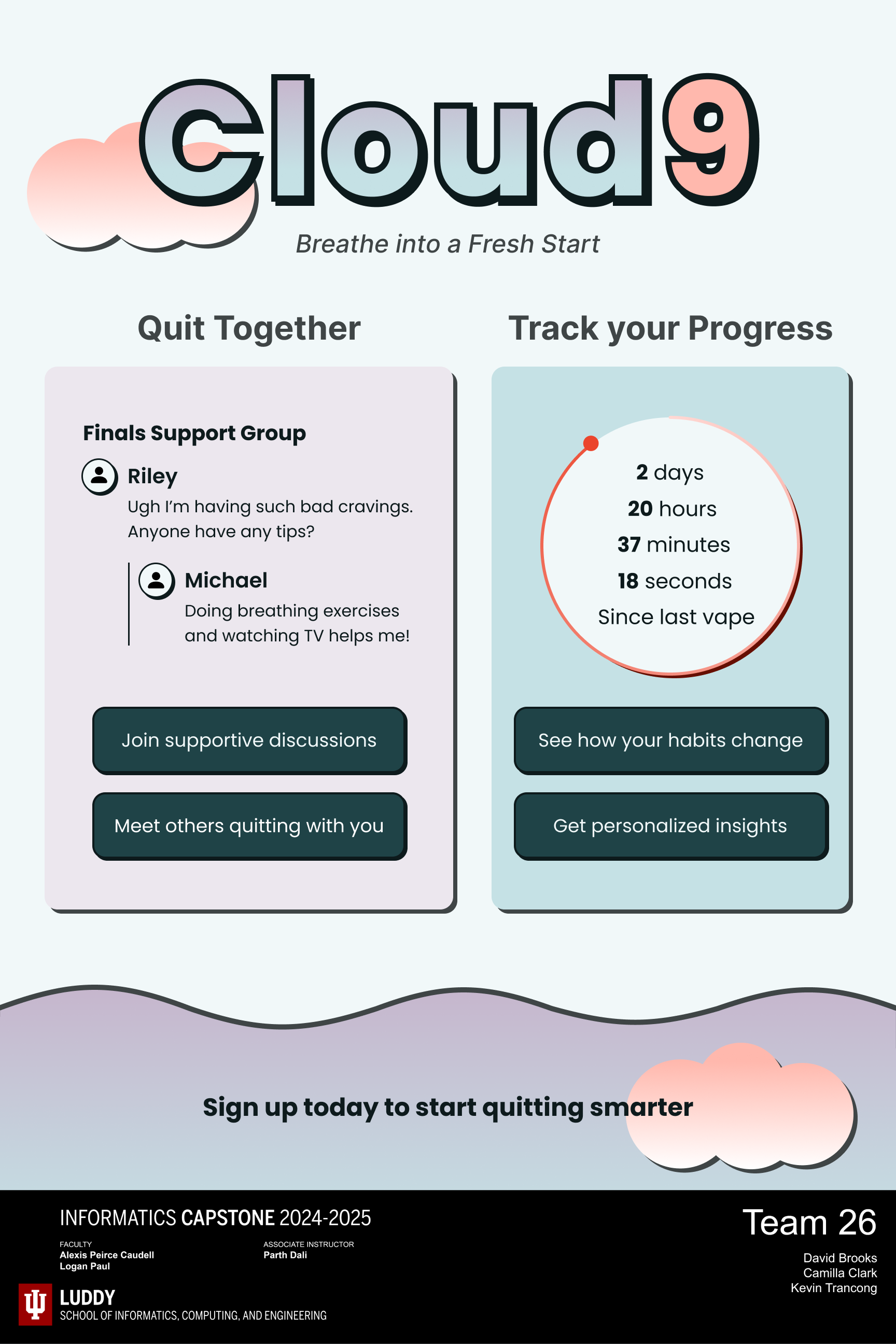
We created a project poster to communicate the problem, solution, and key features of Cloud9 at a glance. The poster was designed for a non-technical audience and served as the primary artifact during the capstone fair.
Video Demo
A short demo video walks through the core user flows and system behavior for viewers who want a deeper look at the product in action.
Outcome & Recognition
Cloud9 was awarded the Students’ Choice Award, selected by fellow capstone students as their favorite project among 53 teams.
Reflection & Takeaways
Cloud9 was my first opportunity to carry a product from initial ideation through final delivery. It challenged me to balance product vision with technical feasibility, time constraints, and user needs.
Lessons Learned
- Adaptability is crucial to success The final iteration of insights is nearly unrecognizable from the inital concept, but it changed for the better. Learning that users did not resonate with the first implementation taught me to challenge my assumptions and prioritize user feedback.
- Communication must happen early and often There were points throughout the project where my team and I realized the pieces we had built separately felt disjointed when put together. This prompted me to lead discussions in our team meetings about how our epics should interact and how to create a cohesive experience. I learned that even when the whole team is working from the same wirefames and documentation, constant communication is a must to ensure intentions are aligned and the pieces of the system blend together seamlessly.
- Knowing what to cut is just as important as knowing what to build As the project evolved, I realized that a few features I initially designed for would not fit within the scope of the project. Though it was difficult to let go of them, learning when to cut or delay features helped me focus on delivering a cohesive core experience rather than an overextended one with shallow implementations.
- Constraints shape better solutions Tight timelines and technical requirements forced the team to make intentional decisions about priorities. These constraints ultimately pushed us toward simpler, clearer solutions that better served users.