
The Problem
Public company financial reports such as 10-K filings contain critical information for investors, researchers, and analysts, yet they are often presented in dense, fragmented, and difficult-to-navigate formats. Existing documents prioritize regulatory compliance over usability, making it time-consuming for readers to locate, compare, and interpret key disclosures. As a result, users face unnecessary cognitive load when working with information that is central to financial decision-making.
Research Goals
This project investigates how information design impacts users’ ability to navigate and interpret complex financial documents. While concepts such as cognitive load and information hierarchy are well established in UX design, they remain underexplored in financial reporting. Working with accounting faculty, this study aims to evaluate whether applying user-centered design principles can measurably improve comprehension, efficiency, and decision-making when working with 10-K filings.
- Establish a baseline: Create a control version that closely mirrors the official SEC format while using clean, maintainable code.
- Isolate design variables: Test individual UX enhancements such as side navigation, pagination, and reworked information hierarchy in separate document versions.
- Measure cognitive load: Evaluate how different layouts affect users’ speed, accuracy, and ability to synthesize information.
- Compare combined solutions: Assess whether integrating multiple UX improvements produces additive benefits.
- Support empirical validation: Generate research-ready interfaces for controlled usability studies and IRB approval.
Early Design Exploration
I began this project by closely analyzing an existing 10-K filing to understand how users currently encounter and navigate financial disclosures. Through this review, I identified recurring usability issues related to information hierarchy, navigation, redundancy, and cognitive load. These findings informed both my early design concepts and the technical direction of the platform.
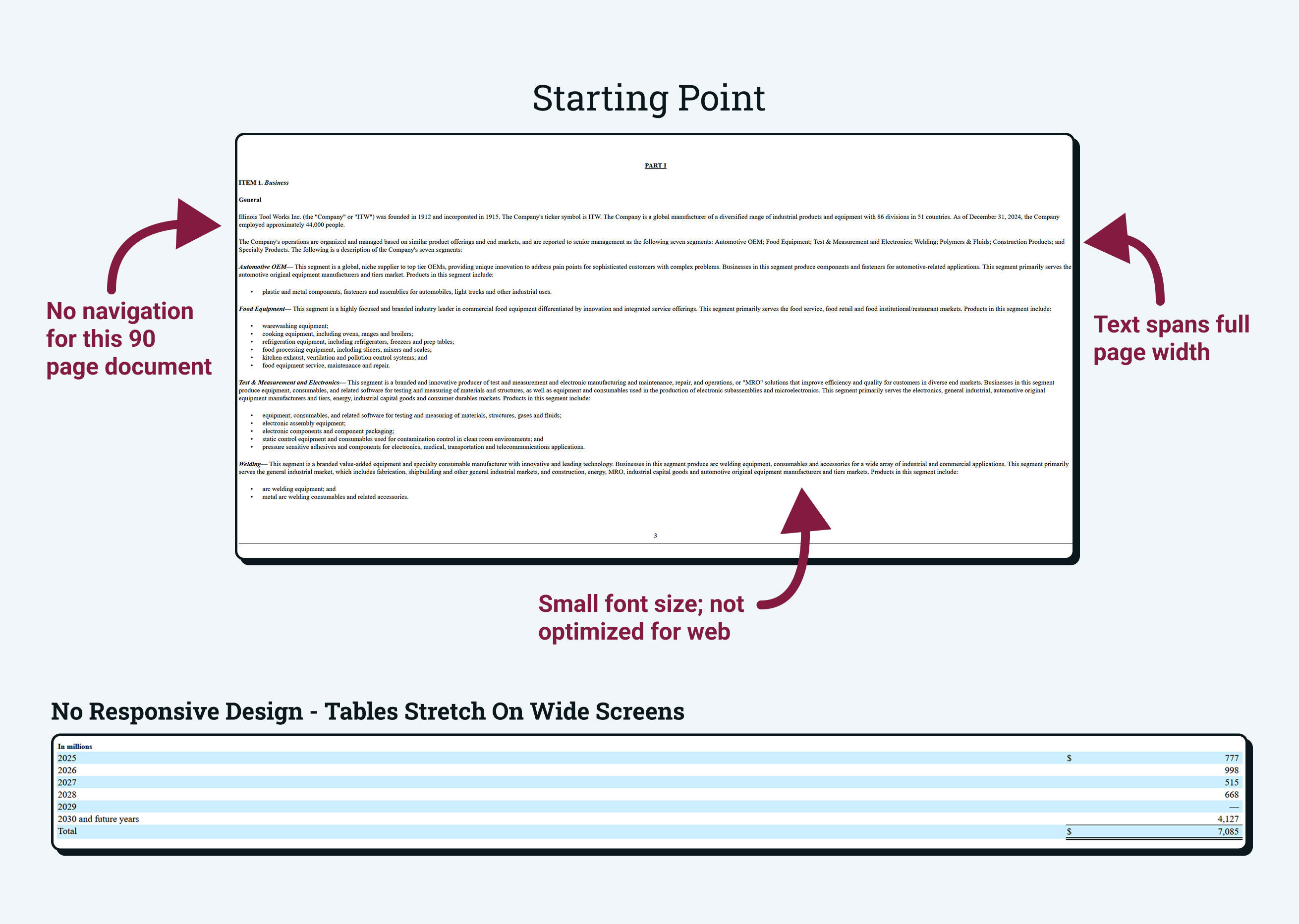
Pre-Redesign Experience
The original 10-K filing closely mirrors the structure of its PDF version. While technically accessible online, it was not designed for efficient navigation, scanning, or comprehension in a web environment.
- No navigation: Users were required to scroll through the 90-page document to locate key sections.
- Poor readability: Small font sizes and full-width text blocks increased cognitive load.
- Non-responsive layouts: Tables and content did not adapt well to different screen sizes.
Initial Design Exploration
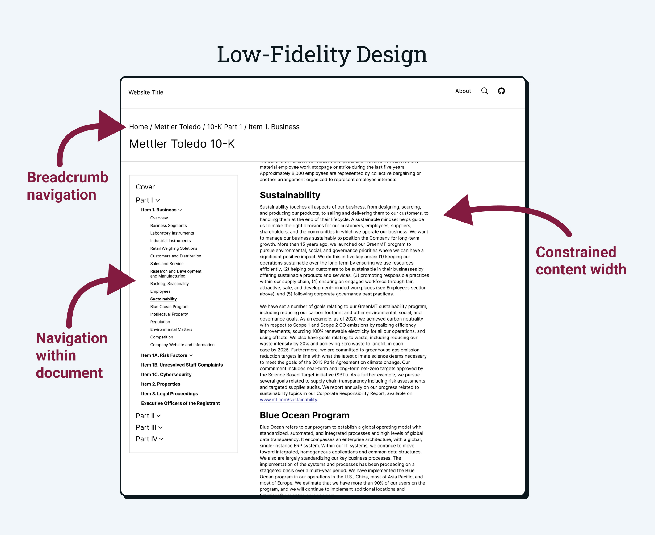
Based on the usability issues identified in the initial analysis, I developed a low-fidelity concept focused on improving navigation, readability, and information hierarchy.
- Breadcrumb navigation: Provided users with clear context about their location within the document.
- Section-based sidebar: Enabled direct access to key items and subsections.
- Constrained reading width: Improved readability by limiting line length.
Scoping & Prioritization
After early design exploration, I worked with faculty stakeholders to translate usability opportunities into a phased improvement roadmap. Each proposed enhancement was evaluated based on implementation complexity and research value, allowing us to prioritize features that could be realistically tested within the initial study timeline.
Phase 1: Core Usability Improvements
- Improved navigation: Breadcrumbs, table of contents access, and sticky side navigation
- Readable layouts: Constrained content width and responsive design
- Clear information hierarchy: Bold headers and simplified labels
- Refined structure: Removing duplicates, reserved sections, and reorganizing related content
- Pagination: Breaking long documents into manageable sections
Phase 2: Advanced Analysis Features for Future Research
- Enhanced metadata tooltips: Contextual explanations and term definitions
- Search functionality: Supporting targeted information retrieval
- Document comparison tools: Highlighting year-over-year changes
- Executive summaries: High-level overviews with deep links
- Data visualizations: Supporting financial interpretation
Overcoming Technical Constraints
Before meaningful UX improvements could be implemented, the underlying document structure needed to be stabilized and modernized. The original 10-K filing was not designed for modular reuse, scalability, or experimentation. Addressing these technical constraints became a prerequisite for building a flexible, research-ready application capable of supporting multiple interface configurations.
Legacy System Challenges
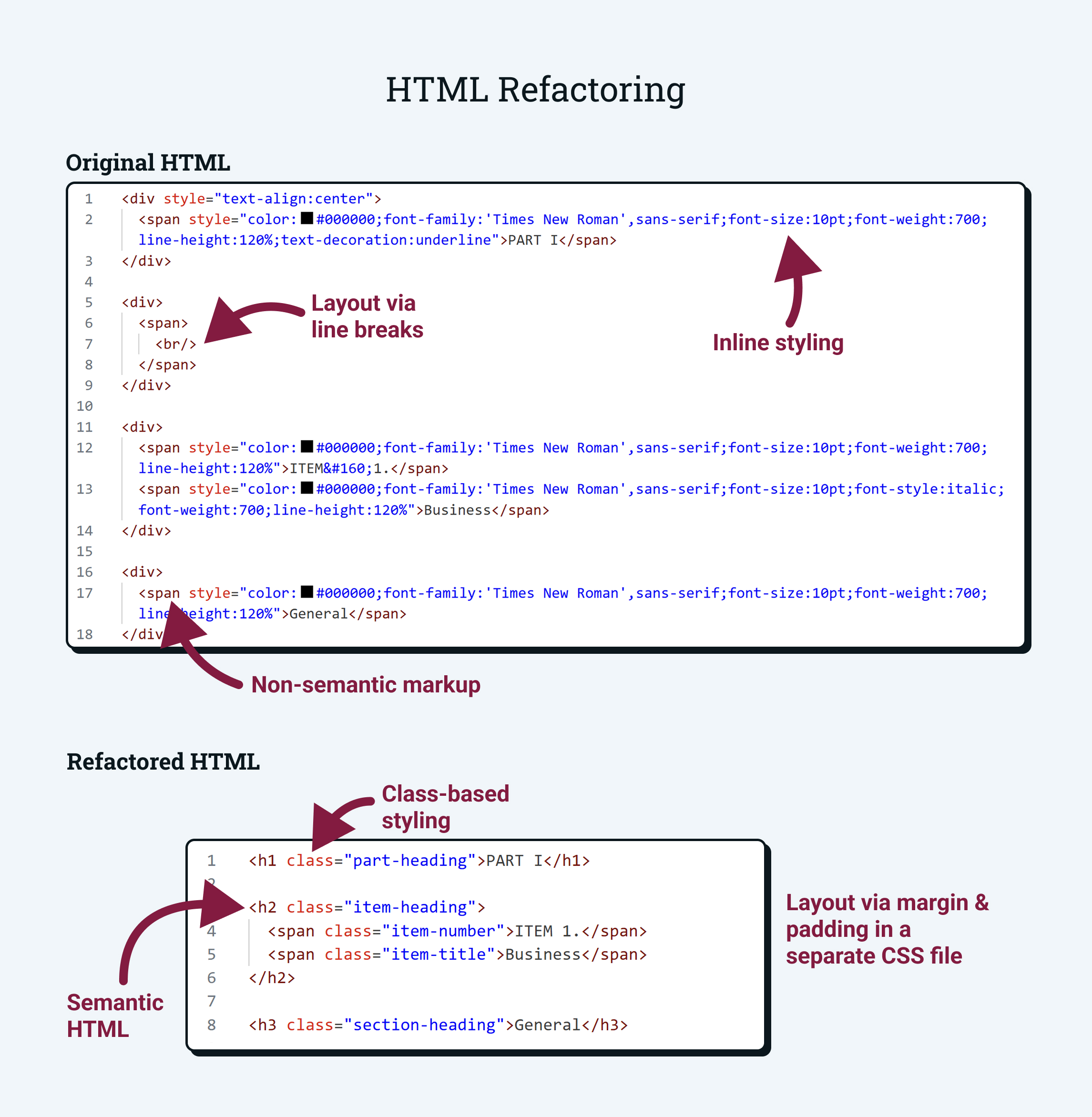
The official SEC HTML filing consisted of approximately 38,800 lines of tightly coupled, non-modular code. Layout was driven primarily by nested tables and extensive inline styling, with minimal semantic structure and no clear separation between content and presentation.
This architecture posed significant barriers to usability experimentation. Individual sections could not be easily isolated, reordered, or repurposed, and even small interface changes risked unintended side effects elsewhere in the document.
Key Technical Limitations
Inline styling
Extensive inline CSS and presentation logic embedded directly in content
Table-based layouts
Tables and line breaks used for structural positioning and layout control
Low semantic structure
Minimal semantic markup for navigation and hierarchy
High coupling
Tightly coupled layout, content, and formatting
Building a Modular Architecture
To support controlled UX experimentation, the 10-K needed to be transformed from a monolithic HTML file into a flexible, modular system. I redesigned the document architecture to separate content, structure, and presentation, enabling multiple interface versions to be generated from a single canonical source.
Refactoring for Reusability
Before modularization was possible, the original SEC filing had to be transformed into a maintainable, semantic format. Key improvements included:
- Replacing inline styles with reusable CSS classes
- Introducing semantic HTML for headings and sections
- Separating layout from content using margin and spacing rules
- Standardizing typography and table structures
This refactoring created a consistent structural foundation that could support navigation, pagination, and accessibility features.
Modular Document Architecture
In addition to cleaning the indivdual sections, I designed a three-layer architecture that allows the same content to be rendered in multiple interface configurations.
Rather than hardcoding layout rules into each section, the system assembles documents dynamically using shared templates and metadata. This architecture supports rapid prototyping of new interface configurations and enables controlled experimentation with different information design approaches.
Architecture Diagram
Presentation Layer
Flask routes, Jinja templates, and version-specific styling
Metadata Layer
A JSON registry defining document structure and ordering
Content Layer
Reusable, semantic HTML fragments
Current Status & Next Phase
Much of the foundational work for this project is now complete. The original 10-K has been fully decomposed into modular, reusable content fragments, supported by a centralized metadata registry and dynamic rendering templates. This infrastructure establishes a stable, scalable foundation for experimentation and ensures that future interface variations can be developed without duplicating or restructuring core content.
The next phase of the project will focus on implementing and evaluating targeted UX interventions, including navigation systems, pagination, and enhanced information hierarchy. In parallel, faculty researchers are pursuing IRB approval and finalizing study protocols to enable controlled usability testing. These efforts will allow the platform to transition from technical foundation to empirical evaluation of how design choices impact financial comprehension.
Reflection
This project challenged me to operate simultaneously as a designer, engineer, and research collaborator. Working within the constraints of a large-scale legacy system required me to rethink how UX improvements are implemented at the architectural level. By building a modular foundation first, I learned how long-term flexibility and research rigor depend on early technical decisions.
Lessons Learned
- UX innovation depends on technical foundations Meaningful interface improvements were only possible after restructuring the underlying document architecture. This project reinforced that scalable UX work often begins with engineering decisions that enable long-term experimentation.
- Designing for research requires methodological rigor Building interfaces for controlled studies required careful separation of variables and consistency across versions. This project reinforced how experimental design considerations shape UX decisions in academic and enterprise contexts.
- Large systems require structured, modular thinking Decomposing a 38,000-line document into maintainable components strengthened my ability to reason about complex systems and design for scalability, reuse, and future iteration.